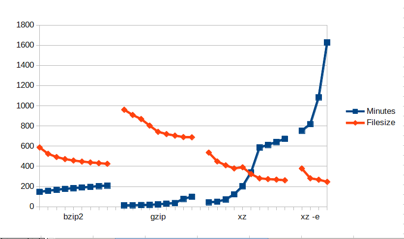
This is the best way I found to visualize this data. Each compression method (bzip2, gzip, etc) starts at 0 or 1 (least compression on the left) and goes up to 9 (most compression on the right). Except for xz -e which just does the odd numbers and 0. They are all compressing the same size file (it was a 32 GB database).
I think this graph nicely shows why xz (which is the same compression as LZMA2/7-zip) is getting so much traction.
Take a look at the
raw data.
Technical notes: I actually divided filesize (from ls) by 10000000 because it worked out better for the graph. I truncated the seconds.
 This is the best way I found to visualize this data. Each compression method (bzip2, gzip, etc) starts at 0 or 1 (least compression on the left) and goes up to 9 (most compression on the right). Except for xz -e which just does the odd numbers and 0. They are all compressing the same size file (it was a 32 GB database).
I think this graph nicely shows why xz (which is the same compression as LZMA2/7-zip) is getting so much traction.
Take a look at the raw data.
Technical notes: I actually divided filesize (from ls) by 10000000 because it worked out better for the graph. I truncated the seconds.